
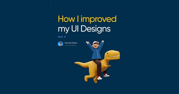
How I Improved My Ui Designs Patr 2
HOW I IMPROVED MY UI DESIGNS PATR 2
How I Improved My Ui Designs Patr 2
- 1. I started using 17pt font size for forms and body
- 2. I started paying attention to empty states
- 3. Also, I invested money in some awesome assets
- 4. I focused on adding some depth to my work
- 5. I got (pretty) good at spacing elements
- 6. I stopped judging my work based on Dribbble
Hey everyone,
It's been a while since I shared a new post - I've been working on many different projects lately. I've been writing my eBook, managing client work and some other stuff.
Anyway, I thought it would be a good idea to share some more tips on how to make your designs better. I hope they will be helpful!
1. I started using 17pt font size for forms and body
I used to use like 13 or 15pt for form inputs, but 17pt works a whole lot better. Not even from the UI side, but mostly the UX.
2. I started paying attention to empty states
I bought a pack of awesome empty state illustrations, and now it's a joy to design them. Sadly, it's often overlooked.
3. Also, I invested money in some awesome assets
I bought a subscription at ui8.net. Now I never lack fantastic icons, illustrations or mockups! It's really worth it.
4. I focused on adding some depth to my work
Adding some shadows and overlapping elements can easily add depth to your designs, and it looks really good.
5. I got (pretty) good at spacing elements
I practiced using soft grids and studied the rules of hierarchy to improve the way I space elements. It's really important!
6. I stopped judging my work based on Dribbble
I don't expect that my "real" work will beat stuff that's trending on Dribbble. The aesthetics of an interface is not the most important aspect of a good design.